Good sleep is one of the most valuable parts of a healthy lifestyle—and your bedroom color scheme plays a much bigger role than you might imagine. The colors surrounding you shape your mood, calm your mind, and help regulate your body’s internal clock. Choosing the perfect bedroom color scheme isn’t just about home décor; it’s about creating a peaceful environment that supports restful sleep.
In this guide, you’ll learn the science behind sleep-friendly colors, expert-recommended combinations, psychology-based tips, and specific suggestions perfect for climates like Pakistan, India, the UAE, the UK, and the US. By the end, you’ll know exactly how to pick a palette that transforms your bedroom into a sleep sanctuary.
What Is a Sleep-Friendly Bedroom Color Scheme?
A sleep-friendly bedroom color scheme is a combination of shades chosen intentionally to promote calmness, reduce stress, and balance your sensory environment. These color selections directly influence your brain’s emotional response.
Sleep-friendly color schemes include soothing neutrals, muted natural tones, low-saturation blues, greens, soft greys, lavender, and warm whites. They reduce visual stimulation and signal the brain to relax—helping you fall asleep faster and stay asleep longer.
Why Bedroom Color Matters for Sleep
- Colors Influence Emotions
Your brain processes color emotionally. Soft blues and greens soothe the nervous system, while bright reds and yellows increase alertness and energy.
- Colors Affect Heart Rate
Studies show that cooler tones lower the heart rate and reduce stress levels, which is ideal for a sleep environment.
- Colors Regulate Your Circadian Rhythm
Light reflected by different hues influences your internal sleep-wake cycle. Soft, low-intensity colors help your mind shift into nighttime mode.
- Colors Control Room Ambiance
Colors affect perceived warmth, brightness, and room size—all of which influence relaxation
How to Choose the Perfect Bedroom Color Scheme for Better Sleep
Choosing the right color scheme means understanding color psychology, your local climate, lighting conditions, furniture style, and personal comfort. Here’s a step-by-step guide.
Start With the Psychology of Calming Colors
Color psychology helps you choose hues that promote relaxation:
Soft Blue
The most recommended shade for sleep. It lowers blood pressure, reduces stress, and signals peace. Pastel blues, muted blues, and powder blues work best.
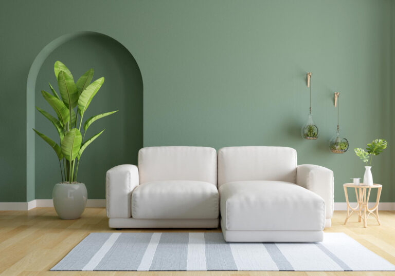
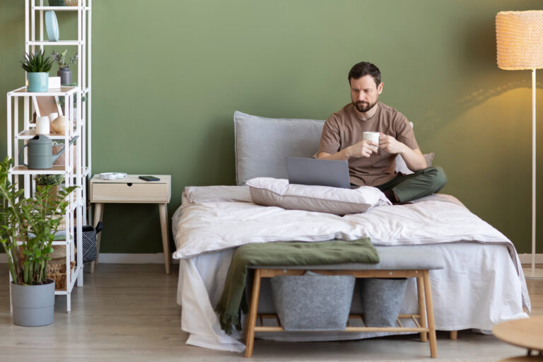
Sage Green
Green symbolizes balance and nature. Sage, olive, and pistachio shades calm your eyes and help reduce anxiety.
Lavender and Lilac
These soft purples have a sedative effect, perfect for those who struggle with nighttime restlessness.
Warm Neutral Beige
Beige, taupe, sand, and oat tones create a cozy atmosphere, ideal for minimalistic and warm bedrooms.
Soft Grey
Light grey creates tranquility but should be paired with warm accents to avoid a cold ambience.
Warm White
Creamy, off-white tones produce a clean, peaceful feel without being too bright.
Consider Your Natural Light Conditions
Lighting dramatically changes how color appears.
Bright Rooms (South-facing)
If your room gets strong sunlight:
- Use cooler tones like soft blue or muted green
- Avoid stark whites—they become too bright
- Balance with beige accents
Dim Rooms (North-facing)
Use warm tones:
- Cream
- Warm grey
- Light taupe
- Soft peach-beige
Warm hues make the space feel inviting, not gloomy.
Artificial Light Rooms
LED lights affect color differently:
- Warm white bulbs enhance beige, taupe, and cream
- Cool white bulbs enhance blue, grey, and green tones
Create a Base + Accent + Texture Strategy
A balanced color scheme includes three layers:
Base Color (60%)
Walls and large furniture
Best sleep-friendly options:
- Soft blue
- Sage green
- Beige
- Warm white
- Light grey
Accent Color (30%)
Curtains, bedding, rugs, throw pillows
Use muted tones only:
- Dusty rose
- Deep sage
- Charcoal
Navy accents (very minimal)
Texture Color (10%)
Warm textures improve sleep comfort:
- Wooden tones
- Cane decor
- Soft brown fabrics
- Linen in earthy hues
This structure ensures harmony and calms the eyes.
Match Your Furniture and Decor Style
Your bedroom style decides your palette direction:
Minimalist Bedrooms
Choose soft grey, warm white, or muted blue
Add natural wood textures
Modern Bedrooms
Choose charcoal + beige
Add matte black metal + sage green
Boho Bedrooms
Choose sand beige + soft olive
Add cane textures + earthy throws
Luxury Bedrooms
Choose champagne beige + warm grey
Add gold accents + soft lighting
Matching style ensures visual calmness—essential for sleep.
Avoid Overstimulating Colors
These colors disturb sleep and should be avoided:
- Bright Red – increases heart rate
- Neon Yellow – overstimulates the brain
- Pure Black Walls – too intense
- Hot Pink – energizing
- Bright Orange – emotionally stimulating
You can use them only in very small decor accents, never as wall colors.
Best Bedroom Color Schemes for Better Sleep (Expert-Approved)
Here are ideal palettes crafted for calmness and better rest.
- Powder Blue + White + Natural Wood
A scientifically backed sleep-friendly combination.
Great for hot climates and humid regions.
- Sage Green + Beige + Cane
Perfect for nature lovers. Creates a sanctuary-like environment.
- Lavender + Soft Grey + White Linen
Ideal for people with stress or insomnia symptoms.
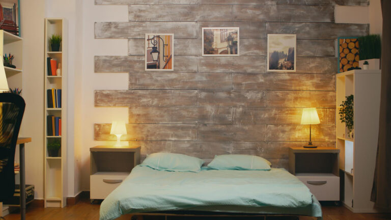
- Warm White + Sand Beige + Light Brown
A cozy, hotel-style color scheme that makes your bedroom feel warm and safe.
- Soft Grey + Cream + Warm Wood
Balanced, modern, and extremely calming.
Common Mistakes to Avoid When Choosing Bedroom Colors
- Using Too Many Colors
Stick to a 2–3 color palette maximum.
- Choosing Bright, High-Saturation Shades
These stimulate your brain and disrupt sleep.
- Ignoring Lighting Conditions
Colors change drastically based on day vs. night lighting.
- Choosing Pure White Walls
They reflect too much light and feel cold.
- Ignoring Your Local Climate
Hot climates require cooler tones.
Cold climates need warm tones for coziness.
Conclusion
Choosing the perfect bedroom color scheme for better sleep is more than a design choice—it’s an investment in your health, mood, and long-term wellbeing. Colors influence how your brain relaxes, how quickly you fall asleep, and how calm your space feels.
By using the psychology of calming colors, considering lighting and climate, and structuring your palette with base, accent, and texture layers, you can easily transform your bedroom into a restful sanctuary.
Soft blues, sage greens, warm whites, and muted neutrals will always be reliable sleep-enhancing choices. Avoid bright, bold, and stimulating hues, and make sure your color scheme aligns with your environment.
A peaceful bedroom leads to peaceful sleep—and peaceful mornings.